Web Design Inspiration for Clients in "Boring" Industries
Web design inspiration for clients in "boring" industries: where to look, what to screenshot, and how to use references to brief an accountant or a plumber.
11 min read
The brief lands on your desk: a pest control company, an accountant, a family-run plumbing firm. You open the usual galleries looking for web design inspiration for clients like this, and find product launches, agency showreels and portfolio sites with cursor effects. Beautiful work, and almost none of it helps.
This is a guide to finding references when the client’s industry is the kind nobody puts in a gallery: where to look, what to capture, how to keep it organised, and how to use it in the conversation with the client. It is the process I have used for local business clients since 2016, minus the parts that wasted time.
Why “boring” industries are hard to find references for
Design galleries reward novelty. A new scroll effect or an unusual type pairing gets featured; a roofer’s site that makes quote requests effortless does not. That is fair enough for what those galleries are for, but it means the sites you most need are filtered out before you start.
Looking through search engines is not much better. The results for any trade tend to be lists written by theme shops and website builders, padded with templates and big brands, because the list exists to sell the product rather than to show you what good looks like.
The good sites do exist. They are just scattered across thousands of small businesses, with no one collecting them. So you have to go and find them.
Where to look
The same trade, in other cities
Your client’s direct competitors are the obvious place to start, but they share a town and often the same tired conventions. Go further afield. Search for the trade in other cities, especially busy, competitive ones where businesses have had to try harder online.
A useful shortcut is to start from Google Maps rather than search results. Find the best-reviewed businesses in the trade, then open their websites. Well-run businesses often have better sites, and you skip past the directories and lead-generation pages that clog up normal search.
Industries that do the same job
This is the most underused source, and the most useful. Ignore what the business sells and ask what the website has to do.
- A plumber and a locksmith both need the phone to ring, fast, often in an emergency.
- A dentist and a day spa both live on online bookings and need visitors to trust a stranger with their body.
- An accountant and a law firm both sell expertise that clients cannot judge in advance, so the site has to earn trust through proof and plain language.
Once you look at the job rather than the trade, your pool of references gets much bigger, and the ideas you borrow feel fresh in the client’s industry because nobody there has used them yet.
Trade associations and directories
Industry bodies and trade associations often list their members, and some run their own industry competitions. They are a quick way to find established businesses in a niche, and the shortlisted firms are usually the ones investing in how they present themselves.
Platform showcases, with a caveat
Webflow, Squarespace, Framer and the rest all run showcases you can filter by industry. They are worth a look, but remember the limit: a platform can only show you sites built on that platform. The best accountant website in your region might be a WordPress site or a custom build, and it will never appear there.
Galleries of local business sites
This is the gap Ordinary Websites was built to fill: a curated gallery of real local business websites, browsable by category, whatever they are built with. If your client is a clinic, a gym or an accountant, it is a faster starting point than digging from scratch.
What to screenshot
The biggest change I made to my own process was to stop saving whole homepages. A full homepage screenshot is hard to compare and easy to forget. Capture sections instead, each one tagged with what it does.
These are the sections worth collecting for almost any local business:
- The hero: what it says, and what it asks the visitor to do.
- The main button: call, book, quote or enquire, and where it sits.
- Pricing: how prices are shown, if at all.
- Proof: reviews, ratings, accreditations, press.
- Location and hours: how the practical details are handled.
- Mobile: the same sections on a phone, which often look very different.
Here are three from my own folders: a bathhouse, an accountant and a dental practice. None of them would make the front page of a showcase gallery, and every one of them taught me something I have used since.
The Bathhouse Albion
Spa
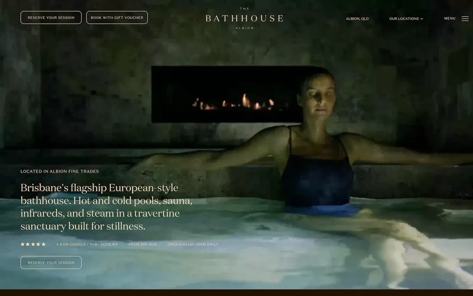
Made with WordPressThe Bathhouse Albion, Brisbane. The hero is all atmosphere: a full-bleed, low-lit pool scene, with the type kept small and pushed to the lower left so the image can breathe. Above the headline sits a tracked, all-caps label; below it, the strip that makes the layout work. Stars, rating, starting price and opening hours run along one thin line of small capitals, quiet enough not to break the mood but right where the eye lands after the headline. A single outlined button finishes the stack, and the header repeats it as one of two matching outlined buttons, so booking is never more than a glance away.
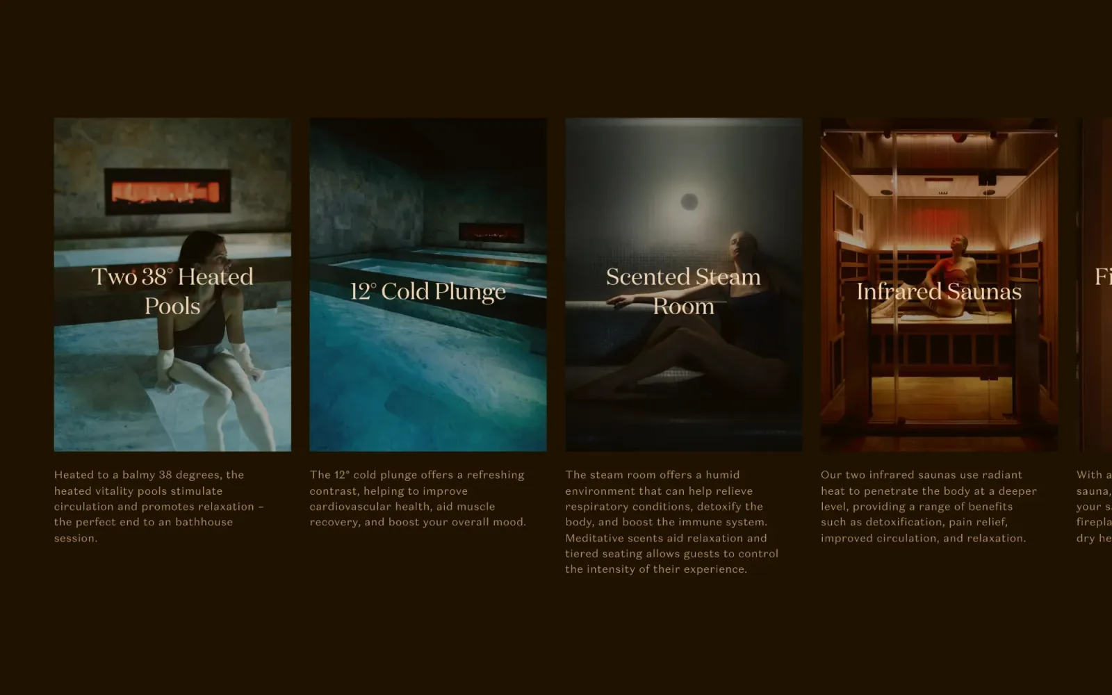
The spaces carousel carries the same mood further down. Tall portrait cards sit on a near-black, warm brown background, each photo graded dark and warm to match, with the space’s name set large in a light serif across the middle of the image. The last card bleeds off the right edge, which tells you there is more without needing an arrow. Scrolling through feels like walking from room to room: immersive, slow and relaxing, which is exactly what the visit should feel like.
Duellix
Accountant
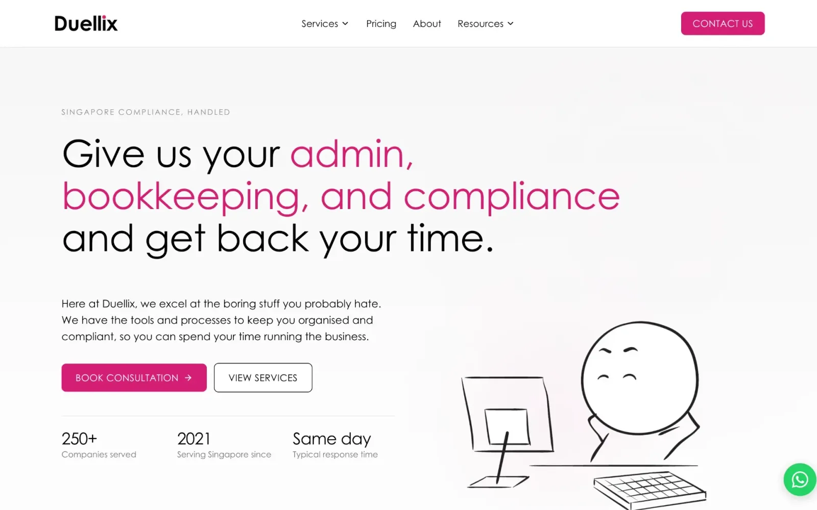
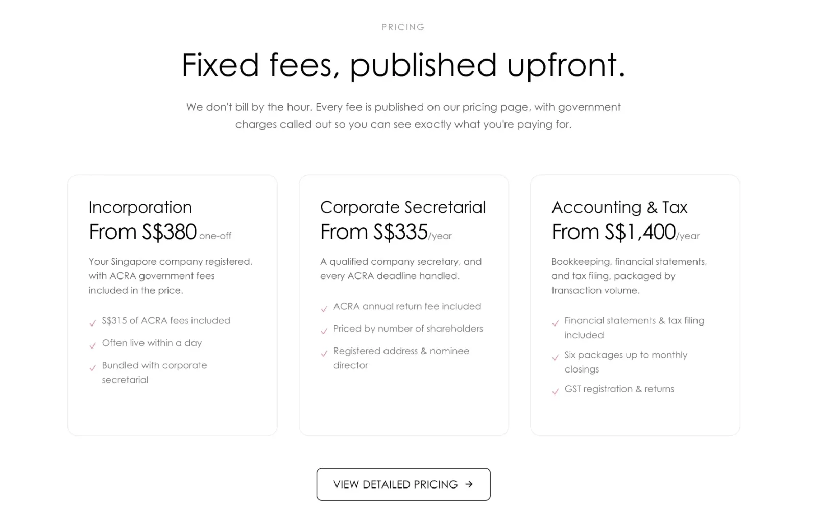
Made with CustomDuellix, Singapore. An accountant website that is a pleasure to read. The hero is fantastically well organised: a near-white canvas, a large, light geometric headline with the key words picked out in magenta, and plenty of space around everything. A filled magenta button and an outlined one sit side by side, so the main action is never in doubt. Under a hairline rule, three figures in big, thin numerals with small grey labels underneath add real value at a glance, and a loose line-drawn character in the corner gives the page a sense of humour without adding clutter.
The pricing section keeps the same discipline. A small tracked label, a big centred heading, then three equal cards with thin borders and soft rounded corners. Each card follows the same order (service, starting fee, a short description, a ticked list), so the eye can compare them straight across. Magenta appears only on the ticks, and a single outlined button below leads to the full pricing page. Clean, modern and easy to follow, it is the kind of section an accountant’s visitors rarely get to see.
Forum Dentistry
Dentist
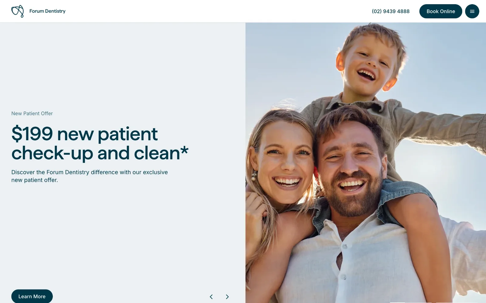
Made with CustomForum Dentistry, Sydney. Simple, professional and clean. A slim white header holds just the logo, the phone number, a dark teal “Book Online” pill and a round menu button, so the two ways to get in touch are always in view. The hero is a straight half-and-half split: a pale grey-blue panel with a short eyebrow, a big, confident dark teal headline and a pill button on the left, and a bright, sunlit family photo filling the right. One accent colour and rounded pills everywhere. It looks modern without trying hard.
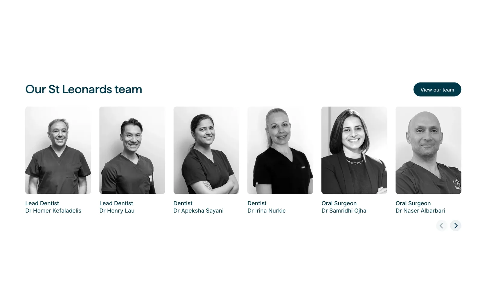
The team section is where the trust comes from. Six portraits sit in an even row, all shot in black and white against plain backgrounds, so the practice reads as one team rather than a collection of headshots. Each has a role in teal above the name, the heading sits on the left with a “View our team” pill on the right, and small arrows hint that there are more. Real faces, presented this consistently, make a stranger far more comfortable booking a check-up.
What makes a reference worth keeping
Not everything that looks good earns a place in the folder. Before saving a section, check four things:
- It belongs to a real, working business. A template demo or a concept shot has never had to win a customer. A live site has.
- It solves your client’s problem. If the client needs calls, a beautiful booking flow is a distraction, however nice it is.
- It still works on a phone. Check the live site on your own phone before you rely on it. Some desktop layouts fall apart at that size.
- You can say why in one sentence. “The fee is in the hero, so nobody has to ask” is a reference. “It feels premium” is a mood, and moods are hard to brief.
Note the date when you save it too. Sites change, and a reference from three years ago may not be on the live site any more when you show it to the client.
How to keep it organised
Make one board or folder per client, not one giant library. Inside it, name each screenshot by section and by reason: “hero, states fee upfront” or “location, parking and transport”. When you come back to it in three weeks, the label tells you why you saved it.
Keep a separate, smaller collection for patterns you see again and again across clients. That is the one that grows into real knowledge over time. It is also the one that, in my case, turned into an overflowing Figma file and eventually into this gallery.
How to use references with the client
References are most useful as a way to agree on what the site has to do, before anyone argues about how it looks.
- Show three to five, not thirty. Pick sections that solve your client’s main problem: getting calls, filling bookings, earning trust.
- Ask what they like, then ask why. “I like this one” is a preference. “I like that the price is right there” is a requirement you can design for.
- Agree the jobs first. Get the client to confirm the two or three things the site must do before you show visual directions.
- Keep the showreels out of the meeting. Showcase agency sites set expectations your client’s budget and content cannot meet, and they pull attention away from what will actually bring in work.
Done this way, references stop being a mood board and become the first draft of the brief.
Start here
You do not have to start from a blank search every time. Browse real local business sites by category, including accountants, clinics, spas, gyms and fitness studios and restaurants, and the newsletter sends five of the best new finds every Friday.
Frequently asked questions
Where do web designers get inspiration?
Design galleries, platform showcases and other designers' portfolios are the usual starting points. For local business clients, the most useful references are usually real sites from the same trade in other cities, and from other industries that do the same job.
Is it OK to copy a competitor's website?
No. Study what a competitor's site does, such as where the phone number sits or how prices are shown, but design your own answer. Copying layout, copy or imagery is both a legal risk and a missed chance to stand apart in the same town.
How many references should I show a client?
Three to five is usually enough. Fewer and there is nothing to compare; more and the conversation turns into picking favourites rather than agreeing what the site needs to do.
What if the client's industry has no good websites?
Look at industries that do the same job. A plumber's site and a locksmith's site both exist to make the phone ring in an emergency; a dentist and a day spa both live on bookings. The pattern carries across even when the look does not.
How do I make a website for a "boring" business interesting?
Start with what customers need from it, then find personality in the details: real photography of the team and premises, a confident type choice, an illustration style, a tone of voice. Interesting comes from specifics, not from effects.