How We Choose the Websites in Ordinary Websites
How we choose the websites in the gallery: how sites are found, the four tests every one has to pass, and what gets left out.
6 min read
A design gallery is only as useful as its choices, so it should be honest about how it makes them. This page explains how we choose the websites in Ordinary Websites: where they come from, the tests every site has to pass, how each one is shown, and what gets left out.
It is also the page every list on this blog points back to. When a post says “how we chose these”, this is what it means.
Where the sites come from
Every site in the gallery is found by hand. Mostly that means picking a trade, a dentist or a restaurant or an accountant, and searching for it in other cities, both in search results and on Google Maps, then opening the websites of the businesses that turn up and looking at each one properly.
It is a lengthy, hard process, and that is a large part of why the gallery exists. The existing design libraries offer very little for local businesses. Their front pages are built from work that agencies and designers submit themselves, and almost nobody submits the website of a dental practice or a family-run restaurant. So the only way to collect good ones is to go looking.
The four tests
Every site in the gallery passes the same four tests.
1. It is live, and the business is real
The site has to be live, and it has to belong to a real business that is operating today. No concept work, no template demos, no redesigns that only exist in a portfolio. A real business site has had to do the job with real customers, and that is the whole point.
2. It is independent or local
The business is an independent or local one, not a national chain or an enterprise brand. A franchise site or a hotel group’s spa can be beautifully made, but it is built with a budget and a brand team that most local businesses will never have, and it solves a different problem.
3. It is judged on how well it does its job
This is the test that matters most. A site is not chosen because it is unusual or technically impressive. It is chosen because it does what a local business site has to do, and does it well:
- Clear services. A visitor can tell what the business does, and for whom, without hunting.
- An obvious call or booking action. The next step, whether that is calling, booking or asking for a quote, is easy to find and easy to take.
- Trust signals. Reviews, real photography, credentials, a named team: whatever helps a stranger believe the business is good.
- A good mobile experience. Many visitors arrive on a phone, often in a hurry.
Good UX and UI run through all four. A site can be quiet and plain and still be excellent, as long as everything a customer needs is clear and easy to use.
4. It is not chosen for its platform
The gallery is platform neutral. Sites are chosen whatever they are built with: WordPress, Elementor, Webflow, Framer, Squarespace, Wix, Shopify or custom code. The platform is shown as “Made with” on every listing, because designers find it useful, but it never decides whether a site gets in.
On 13 October 2026, the published sites in the gallery were made with WordPress (56), custom code (53), Webflow (17), Squarespace (10), Shopify (9) and Duda (1). That spread is not planned. It is simply what turns up when the only question is whether the site does its job.
The tests in practice
Here are three sites from three industries, built on three different platforms, each a good example of one of the tests.

Skin Boutique
Clinic
Made with SquarespaceCaptured
Clear services: Skin Boutique. The services section is a tidy grid of eight cards, each with a photo, a treatment name, two or three lines of explanation and its own labelled button. A visitor can scan the whole menu in seconds and go straight to the treatment they came for, without opening a dropdown or guessing at jargon.
Hotel Harry
Restaurant
Made with WordPressCaptured
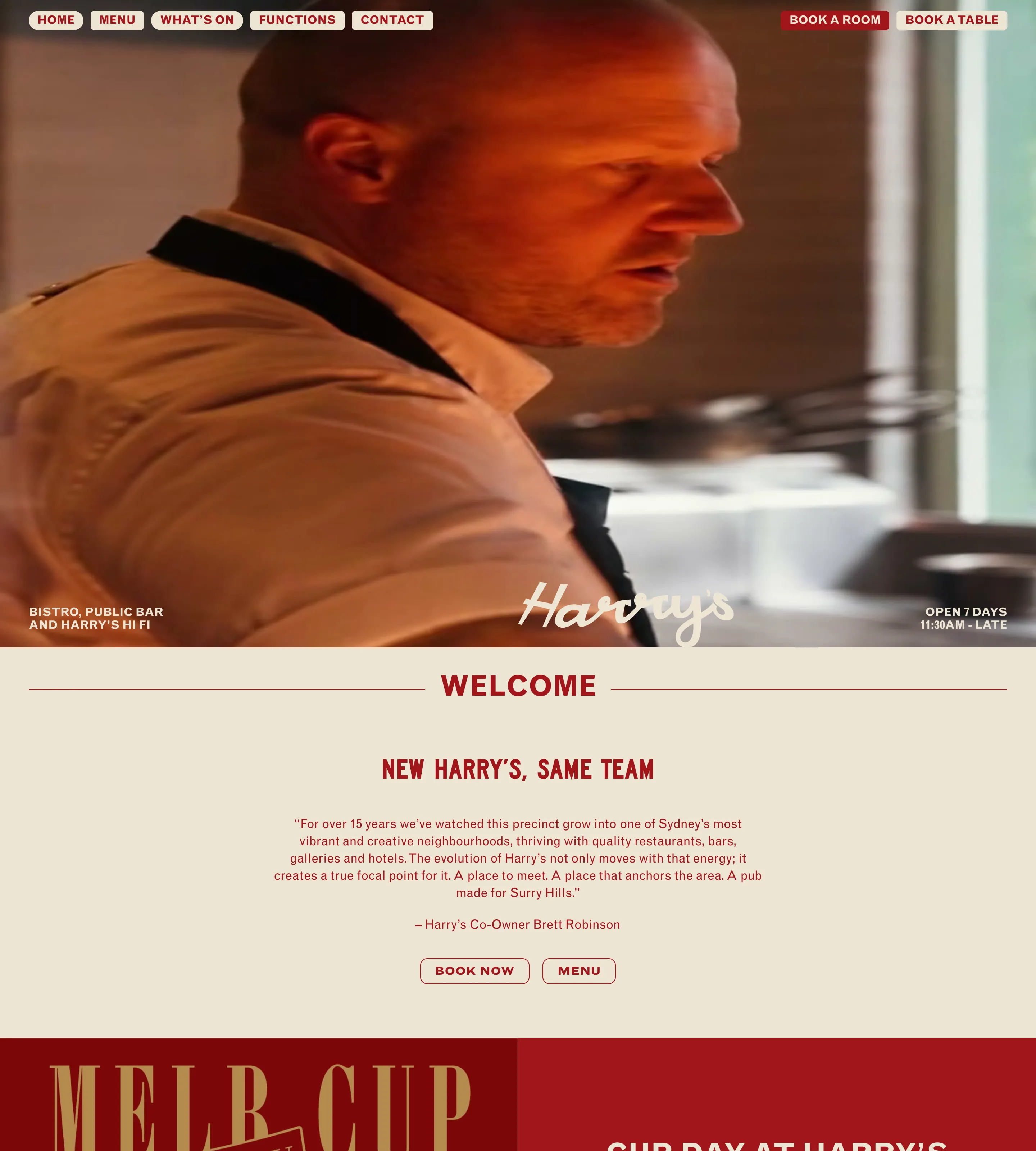
An obvious action: Hotel Harry. A pub with rooms has two things to sell, and the header says so: “Book a room” and “Book a table” sit side by side in the top corner, styled apart from the rest of the navigation. The opening hours sit in the corner of the hero, and the welcome section repeats a “Book now” button straight away. Wherever you are on the page, the next step is in view.
Dental Smiles London
Dentist
Made with WebflowCaptured
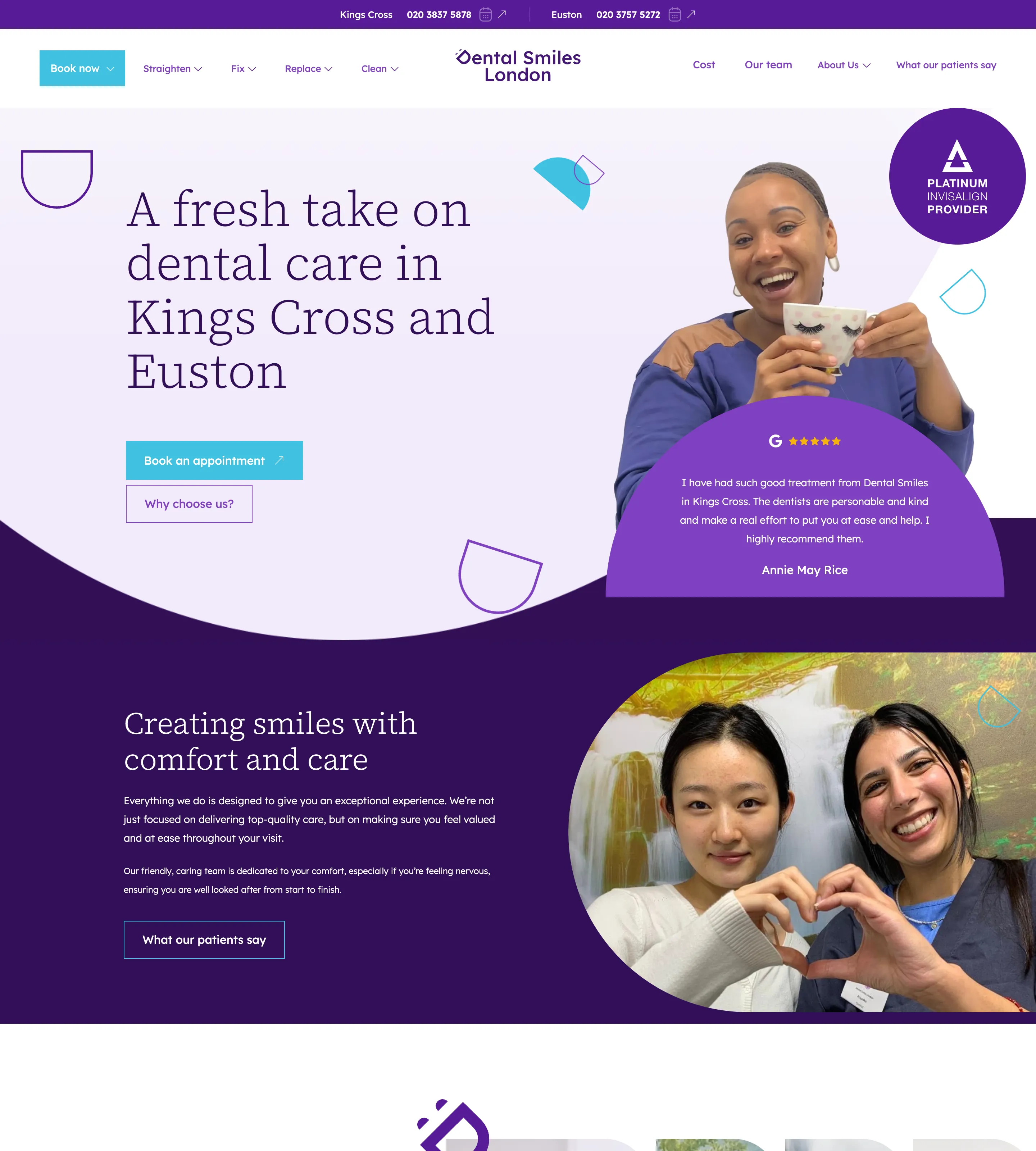
Trust signals: Dental Smiles London. The hero puts a five-star Google review right beside the headline and a provider badge in the corner. The phone number for each of its two locations runs across the very top of the page, and further down a row of short patient videos shows real people talking about their treatment. For a nervous patient choosing a dentist, that is a lot of reassurance before the first scroll.
How each site is shown
Every site in the gallery gets the same treatment, so they can be compared fairly:
- A full-page screenshot of the homepage, captured at desktop size.
- The date it was captured. The gallery is an archive of how each site looked when it was featured, not a live mirror. Sites change, and the date is always shown, so you know what you are looking at.
- What it is made with, as described above.
- A short note on the design, written from the screenshot: what stands out and why it works.
What gets left out
Plenty of sites do not make it in, for all sorts of reasons. The most common are sites that look generic or AI-generated, sites with broken sections, and sites with poor UX or UI that get in the way of the customer. National chains and enterprise brands are left out too, however well made their sites are.
None of this is a judgement on the businesses themselves. It just keeps the gallery useful: every site in it should be one a designer can learn something from.
Why it works this way
The gallery exists for designers who build for local and service businesses and could never find good references for them. The full story is in the introduction to Ordinary Websites, and the argument for why the big galleries miss these sites is in why galleries miss local business web design inspiration.
If you want to see the results, browse the gallery by category, from dentists and clinics to restaurants and accountants. And every Friday, the newsletter sends five of the best new finds.
Frequently asked questions
How are sites chosen for Ordinary Websites?
Every site is live, belongs to a real, currently operating independent or local business, and is chosen on how well the design does its job: clear services, an obvious call or booking action, trust signals and a good mobile experience.
How do you find the sites?
By hand, mostly by searching each trade in other cities and on Google Maps, then looking through the websites of the businesses that turn up.
Does the platform a site is built with matter?
No. Sites are chosen whatever they are built with, from WordPress and Squarespace to Webflow and custom code. The platform is shown as Made with on every listing, but it never decides whether a site gets in.
What gets left out?
Among other things, sites that look generic or AI-generated, sites with broken sections, and sites with poor UX or UI. National chains and enterprise brands are left out too, however good their sites are.