Small Business Website Design Inspiration: Why SaaS Fails
Why SaaS landing pages make poor small business website design inspiration, shown with three real plumbers, and the few SaaS habits worth keeping.
7 min read
A plumber asks for a new website. The designer opens their folder of small business website design inspiration, and it is full of beautiful SaaS landing pages: big abstract headlines, soft gradients, product screenshots floating in space, a “Get started” button and a lot of smooth scrolling. The site that comes out the other end looks expensive. It also makes it surprisingly hard to get a plumber to your house.
I have seen clients arrive with exactly these references for trade and local sites, and I understand why. SaaS sites are where most of the polish on the web lives. But as references for a local business, they mostly teach the wrong lessons, because they were built to solve a completely different problem.
Why SaaS pages look the way they do
A SaaS landing page sells a product to someone sitting at a desk, often comparing several tools over days or weeks. The visitor has time. The goal is usually a free trial or a demo, and the page has to explain something abstract, software, in a way that feels exciting. Hence the metaphor headlines, the illustrated diagrams, the animated product shots and the long scroll that tells a story.
A plumber’s visitor is standing in a kitchen with water on the floor and a phone in one hand. They want to know three things: does this person cover my area, can they come now, and how do I reach them. Every design choice on the page should serve those questions, and most SaaS habits get in the way of them.
Here are the habits that do not transfer, with three real plumbing websites that show what to do instead.
A Grade Plumbing and Gas
Plumber
Made with CustomCaptured
Inner City Plumbing
Plumber
Made with WordPressCaptured
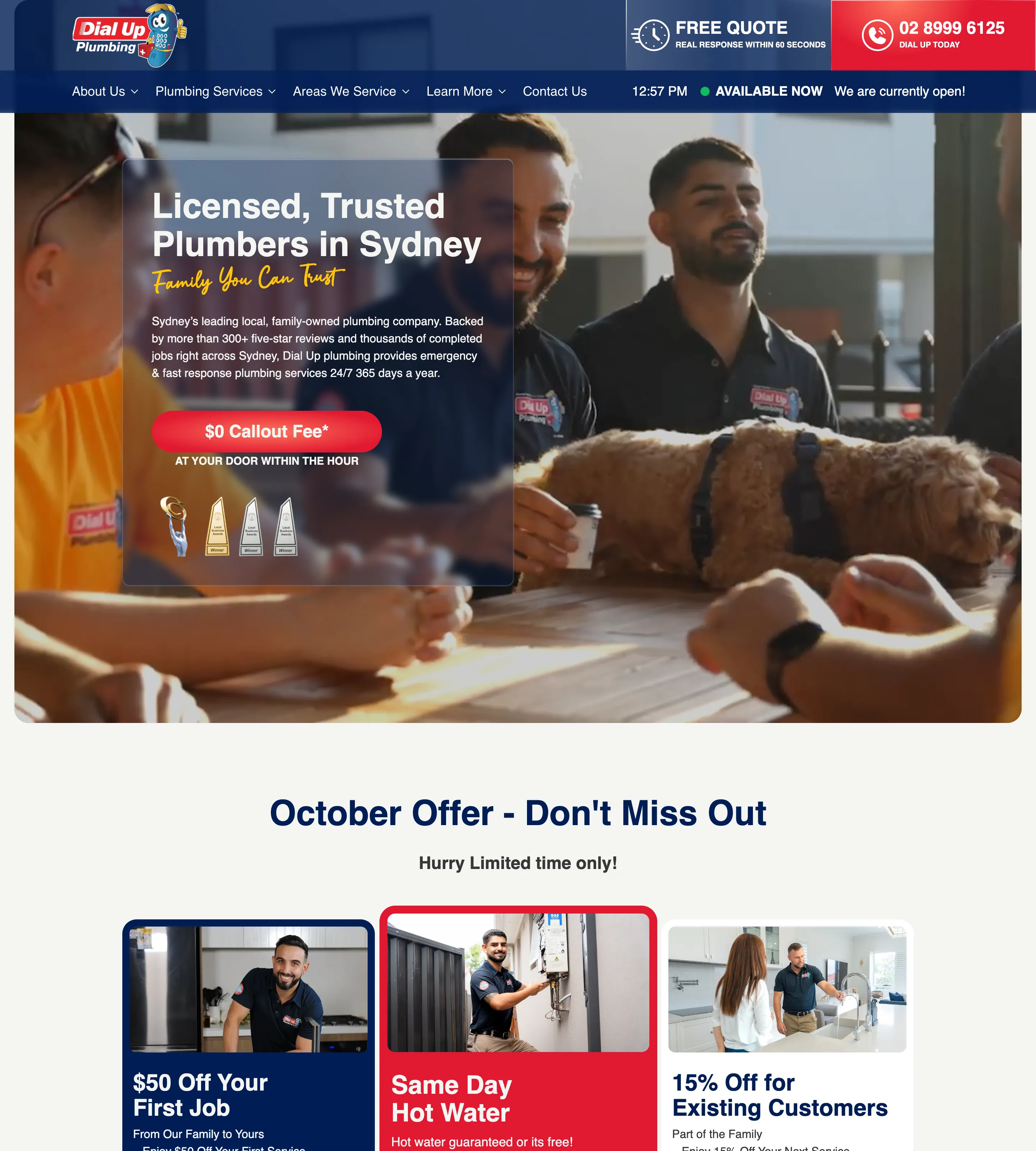
Dial Up Plumbing
Plumber
Made with WordPressCaptured
1. The abstract headline and “Get started”
SaaS heroes are built around a big idea: “Work, reimagined.” “The future of teams.” Then a “Get started” button that leads into a sign-up flow.
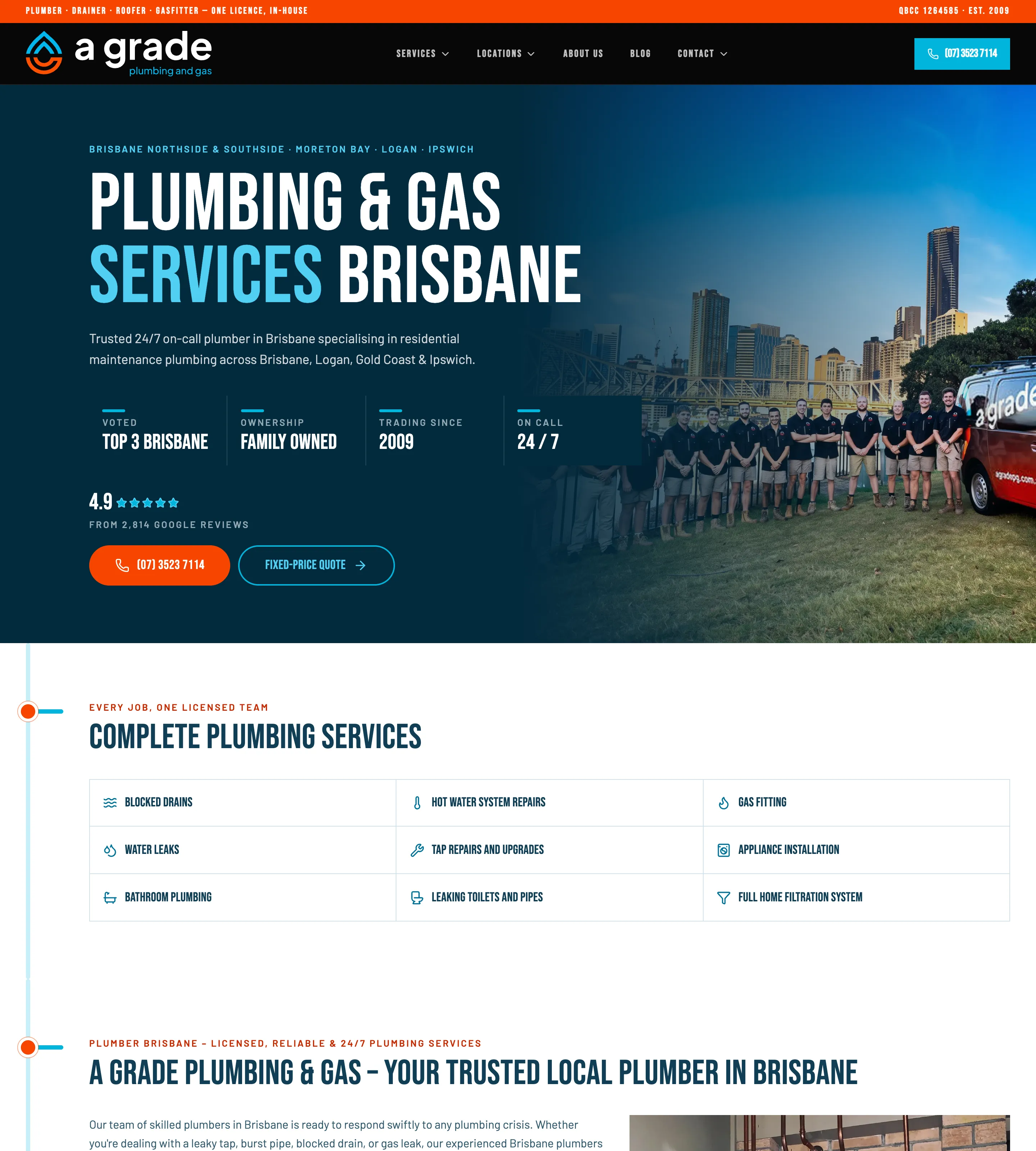
On a trade site, the headline should say what and where, and the button should be the phone. A Grade Plumbing and Gas in Brisbane does both in the first screen. A small line above the headline lists the actual areas it covers, Brisbane Northside and Southside, Moreton Bay, Logan and Ipswich, and the headline itself is “Plumbing & Gas Services Brisbane”, set in tall condensed capitals. The main button is the phone number in bright orange, with “Fixed-price quote” as a quieter outlined option beside it. Nobody has to interpret anything.
2. The customer logo wall
SaaS pages prove themselves with a row of famous client logos. A plumber’s customers are households, and their logos are not coming.
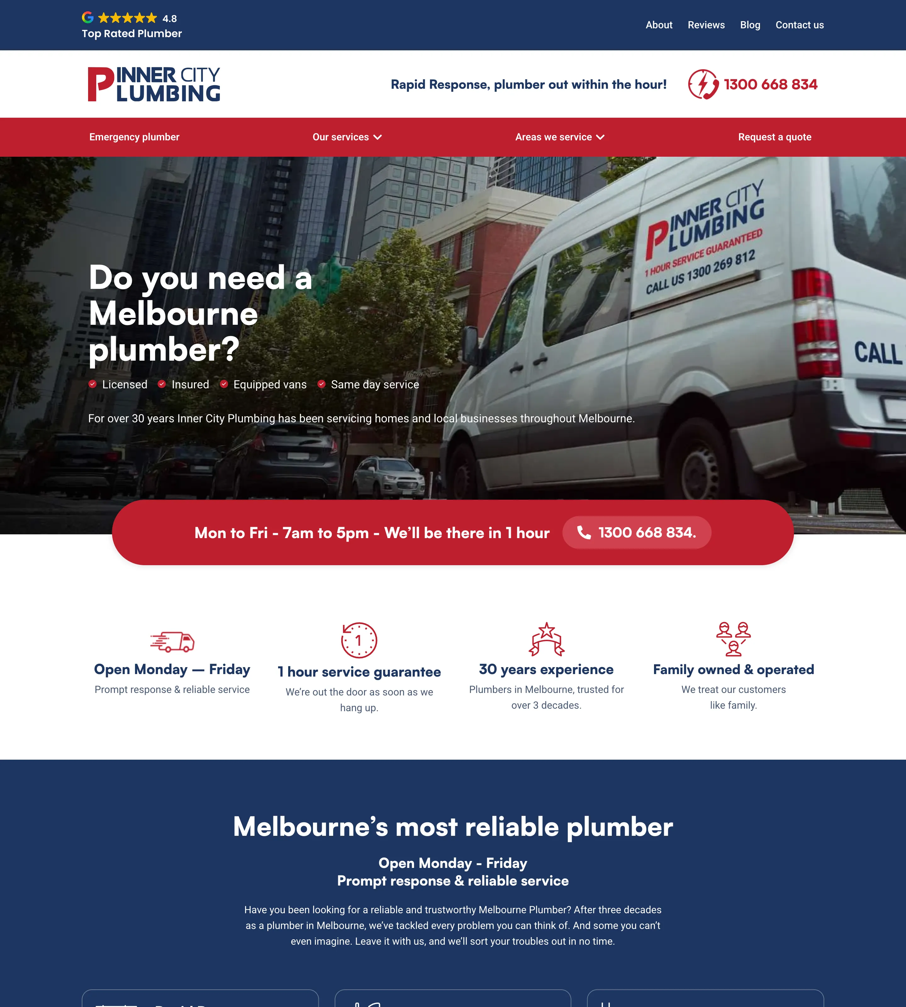
The local equivalent is a short, specific set of facts. A Grade’s hero carries a row of four: voted among the top three in Brisbane, family owned, trading since 2009, on call 24/7, then its Google rating and review count. A thin bar at the very top of the page even lists the licence number. Inner City Plumbing in Melbourne puts its Google rating in the top bar and four plain promises under the hero: open Monday to Friday, a one-hour service guarantee, thirty years of experience, family owned. Proof for a trade is about licences, years and reviews, not brand names.
3. Pricing tiers
SaaS pricing is a three-column table: Starter, Pro, Enterprise. Plumbing does not work that way, and a visitor does not need a plan. They need to know whether calling will cost them before anyone turns up.
Dial Up Plumbing in Sydney answers that in the hero, with a bright red button offering a free call-out and the line “at your door within the hour” beneath it. A Grade offers a fixed-price quote. Neither builds a pricing page into the homepage. They state how pricing works, which is the question the visitor actually has.
4. The calm, minimal hero
SaaS heroes are deliberately quiet: one sentence, lots of space, nothing urgent. For a business that sells emergencies, that calm reads as “not available”.
Dial Up’s header is the opposite of quiet, and rightly so. Next to the navigation sits a live clock, a green “Available now” dot and the words “We are currently open!”, with a red phone block in the corner. Inner City runs a red bar straight under its hero: “Mon to Fri, 7am to 5pm, We’ll be there in 1 hour”, with the phone number as a button inside it. The page answers “can you come now?” before the visitor has to ask.
5. Product screenshots and illustrations
SaaS pages show the product: dashboards, interface shots, illustrated people using laptops. A plumber’s product is the plumber.
All three sites lead with their own people and vehicles. Inner City’s hero is its own white van, logo and phone number painted on the side. Dial Up’s shows its crew in branded shirts on a job. A Grade lines the whole team up in front of the city skyline with the company van at the end of the row. A stranger is deciding whether to let someone into their home, and real faces and liveried vans answer that far better than any illustration.
6. Motion for its own sake
This is the habit I see most often. Scroll-triggered reveals, sections that slide and fade in, text that animates word by word, page transitions borrowed from a product launch. On a SaaS site they add a sense of craft. On a local service site they mostly add waiting.
Visitors to a plumber, a dentist or a cleaner are not fussed about fancy things. They are trying to find a number, an address or a price, often on a phone, often in a hurry. Every animation that holds content back until it finishes is time between them and the call. None of the three plumbers here relies on motion to make its point. Everything that matters is simply there when the page loads.
What is worth borrowing from SaaS
SaaS sites are not useless as references. Two things transfer very well.
Type hierarchy. SaaS teams tend to have well-organised type systems: a clear scale, consistent weights, headings that step down in a predictable way. That discipline helps any site, and local sites often need it more than most, because they carry so much practical information. A Grade’s tall condensed capitals for headings, with small spaced labels above them and plain body text below, is a good example of a clear hierarchy on a trade site.
A focus on conversion. SaaS pages are relentless about the one action they want, and local sites can learn from that. Decide what the main action is, a call, a quote request, a contact form, and lead every section towards it. All three plumbers here repeat the phone number or the quote button again and again, so the next step is never more than a glance away.
The trick is to borrow the discipline, not the surface.
A quick translation table
| SaaS habit | Local business equivalent |
|---|---|
| Abstract headline | What you do and where you do it |
| “Get started” or “Start free trial” | The phone number, a quote, or a booking |
| Customer logo wall | Google rating, licence number, years trading |
| Pricing tiers | How pricing works: call-out, quote, starting price |
| Calm, empty hero | Opening hours, response time, “available now” |
| Product screenshots | Your team, your van, your work |
| Scroll animation and transitions | Content that is simply there when the page loads |
| Strong type system | Keep it: clear hierarchy helps every site |
| Single-minded conversion focus | Keep it: lead every section to the call or form |
Keep going
For the jobs every local homepage has to do, see local business homepage design: 6 jobs it has to do, and for choosing the main button, local business website call to action: call, book or quote?. Browse all the plumber websites in the gallery, and every Friday the newsletter sends five of the best new finds.
Frequently asked questions
Can I use SaaS websites as design inspiration for a small business?
For some things, yes: type hierarchy, restraint with colour, consistent components and a clear focus on one action. For the structure and content of the page, no. A SaaS page is built for someone researching at a desk; a local business page is built for someone who needs help today.
What should a plumber's homepage show first?
Where they work, how to call them, and whether they can come now. A service area, a phone number that can be tapped, and a line about response time or opening hours do more in the first screen than any headline.
Where can I find small business website design inspiration?
Real sites from the same trade in other cities, and from other local businesses that do the same job. Galleries built around SaaS, agencies and portfolios rarely include them, which is why Ordinary Websites collects them by category.
Should a small business website have pricing tiers?
Rarely in the SaaS sense. What most local customers want is how pricing works: a call-out policy, a fixed-price quote, a starting price. Say that plainly instead of building a three-column plan table.